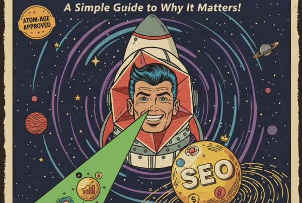
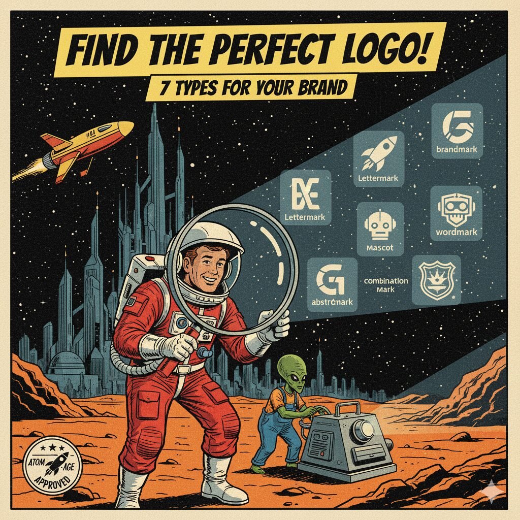
When you think of your favorite brands, what comes to mind first? Most likely it is their logo. A good logo is not just a pretty picture, it is the symbol that ties your entire brand identity together. But here is the thing: not all logos look or work the same. There are several different types of logos, and the one you choose can say a lot about your business.
In this guide, we will break down the 7 most common types of logos in a simple, easy-to-understand way with real-world examples you already know.
1. Wordmark Logos
A wordmark is a logo made up of your business name written in a unique font or style. It relies completely on typography to make your brand memorable. Wordmarks are clean, simple, and work especially well if your name is short or distinctive.
-
Examples: Google, Coca-Cola, Visa
-
Why It Works: When designed well, the name itself becomes the logo. Think of Google’s playful colors or Coca-Cola’s iconic script. You can spot them instantly.
-
Best For: Startups, small businesses, or anyone who wants their brand name front and center.
2. Lettermark Logos (Monograms)
Lettermarks are logos that use just initials instead of spelling out the whole company name. This makes them sleek and easy to remember, especially if your name is on the longer side.
-
Examples: IBM (International Business Machines), HBO (Home Box Office), NASA (National Aeronautics and Space Administration)
-
Why It Works: Nobody wants to say “International Business Machines” every time. They just say IBM. Lettermarks turn long names into something clean and recognizable.
-
Best For: Companies with long or complicated names that want something simple but professional.
3. Brandmark Logos (Symbols or Icons)
A brandmark is a symbol-only logo with no words, just a strong visual that represents your brand. These can be literal, like Apple’s apple, or more symbolic, like Nike’s swoosh.
-
Examples: Apple, Twitter (the bird), Nike (the swoosh)
-
Why It Works: Images stick in people’s minds faster than words. Once you are established, your audience does not even need to read your name. They recognize the mark.
-
Best For: Established brands or businesses that want a bold, minimalist identity.
4. Combination Logos
Combination marks pair text, such as a wordmark or lettermark, with a symbol or icon. They are flexible because you can use the whole logo together, or just the symbol or text on its own.
-
Examples: Adidas, Burger King, Lacoste
-
Why It Works: You get the best of both worlds. People learn your name and also start to associate it with an image. Over time, either one can stand alone.
-
Best For: Most businesses, especially those still building recognition but who also want a visual element to grow into.
5. Emblem Logos
Emblems are logos where text is contained inside a symbol or badge, often with a circular or shield-like shape. They feel classic and authoritative, like a stamp of approval.
-
Examples: Starbucks, Harley-Davidson, NFL
-
Why It Works: Emblems have a sense of tradition and strength. They often look official, making them popular with sports teams, schools, and institutions.
-
Best For: Organizations, schools, nonprofits, and brands that want to communicate heritage or authority.
6. Abstract Logos
Abstract logos use unique shapes, lines, or geometric designs instead of recognizable objects. These logos are more about mood, style, or meaning than literal representation.
-
Examples: Pepsi’s circle, BP’s flower-like starburst, Adidas’s three-petal trefoil
-
Why It Works: Abstract shapes can represent big ideas such as movement, energy, or innovation without being tied to one specific object. They are versatile and unique.
-
Best For: Modern companies, creative businesses, or brands that want something bold and one-of-a-kind.
7. Mascot Logos
Mascot logos bring a brand to life using a character or illustration. They are often fun, colorful, and approachable, which makes them especially appealing to families and younger audiences.
-
Examples: KFC’s Colonel Sanders, the Michelin Man, Mr. Pringles
-
Why It Works: A mascot gives your brand personality. People can connect with a “face” more easily than a symbol, which builds loyalty and approachability.
-
Best For: Food and beverage brands, entertainment companies, sports teams, and family-friendly businesses.
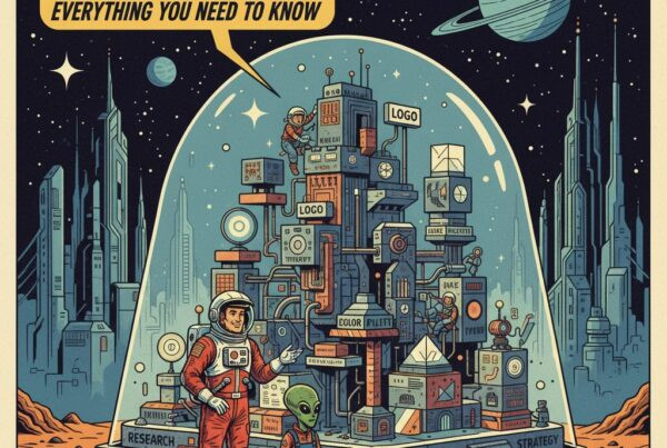
Which Logo Type Is Right for You?
Choosing a logo is not just about what looks good. It is about what works best for your business. If your name is short and snappy, a wordmark might be perfect. If you are aiming for something timeless and symbolic, a brandmark or abstract design may fit better. And if you want flexibility, a combination logo is a safe bet.
At Atomic Plane, we do not just design logos, we build brand identities. That means we help you choose the right type of logo, pair it with colors, typography, and design elements, and create a toolkit you can use everywhere from social media to packaging.
Because at the end of the day, your logo is not just a design. It is the launchpad for your entire brand.
Check out this in depth resource from adobe: Types of logos and how to use them.