Your Brand Colors are honestly one of the most powerful—and most misunderstood—tools you have. A lot of business owners treat it as a personal choice: “I like blue” or “Let’s use green because we sell plants.”
Here at the agency, we don’t treat color like a paint sample; we treat it like a strategic decision. Every shade we pick for your Brand Identity is chosen deliberately to spark a specific emotion, back up your core values, and, yes, actually guide your customers to take action.
Simply put, it’s not about finding colors you like; it’s about choosing the Brand Colors that your ideal Target Audience is wired to respond to. I want to give you an inside peek at how we go from the raw science of Color Psychology to a final, stunning, and highly effective brand palette.
1. The Science is Simple: Colors Talk to Your Brain
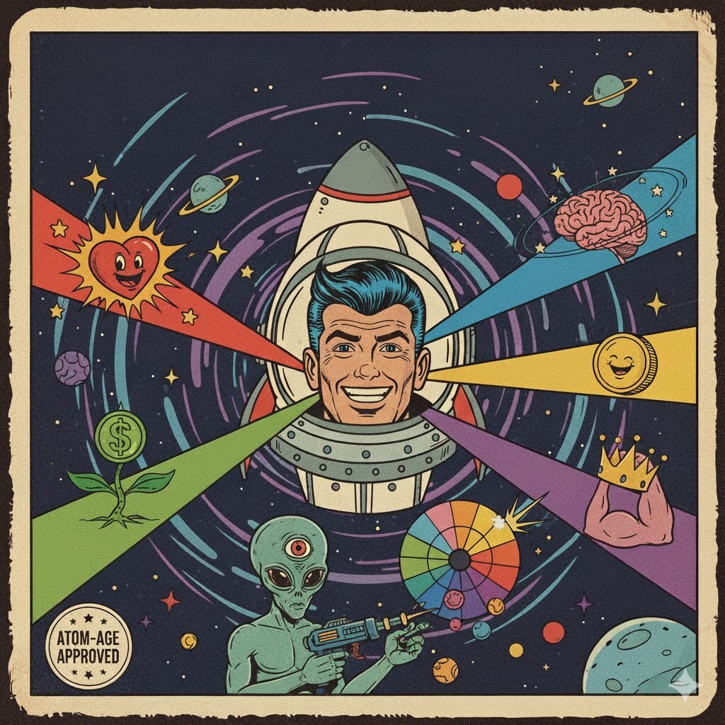
Your brain processes color faster than it processes words or shapes. Think about that: before a customer reads your amazing headline or even looks at your logo, they’ve already formed an initial opinion based purely on your colors.
We use this science as our starting point. Here’s what some of the most common Brand Colors are silently saying to your customers:
| Color | Core Emotion & What It Says | Where We Use It Strategically |
| Blue | Trust, Security, Reliability, Calm. | Financial services, software, healthcare, or any B2B brand that needs to establish authority. |
| Red | Excitement, Urgency, Passion, Energy. | Sale banners, food products, entertainment, and brands where the focus is on quick action. |
| Yellow | Optimism, Clarity, Warmth, Joy. | Creative services, hospitality, or any brand emphasizing happiness and approachability. |
| Green | Health, Growth, Tranquility, Money. | Eco-friendly businesses, wellness products, and brands focused on wealth or nature. |
| Black | Sophistication, Authority, Luxury, Formality. | High-end fashion, luxury goods, and anything that needs to project premium status. |
The Bottom Line: When we choose a primary color for you, we are basically setting the emotional temperature of your entire business. We aren’t guessing; we’re using proven psychological foundations.
2. The Strategic Twist: Why We Don’t Stop at “Trust”
The big mistake many people make is stopping after the first step. If you’re a financial firm, you might think, “I must choose blue.” But if every single competitor on the market has done the exact same thing, you’ve immediately blended into the background.
Our process uses two crucial steps to make sure your palette stands out:
A. Finding Your Unique Voice
Your Brand Colors need to directly support your Unique Value Proposition.
- Take the “Trusted” Advisor again. If your unique value is approachability and human connection (not just being trustworthy), we might use that classic blue, but pair it with a warm, optimistic secondary color (like a soft coral or a muted yellow). This signals, “We are professional and we’re easy to talk to.”
- The Power of Contrast: A successful Color Palette is never just one color. It’s a ratio of shades: a dominant color for the main emotion, a secondary color for dimension, and a high-contrast accent color used just for calls-to-action (CTAs) like a “Buy Now” button.
B. Ensuring Digital Readability
Color choices aren’t just for emotion; they’re functional. We have to ensure every shade we pick works well for Graphic Design, especially online. Will the text contrast enough with the background? Does the color palette comply with accessibility standards so all users can easily read your site? If your colors don’t pass this test, they aren’t working hard enough for you.
3. Brand Colors – Our Process: From Feeling to Final Code
You don’t just tell us your favorite color, and we don’t just grab a random bright shade. Our strategic color process is fully integrated into how we develop your overall Brand Identity.
- Discovery & The Goal: We always start by asking: What is the one specific action you want people to take, and what is the single emotion you want them to feel?
- Competitor Mapping: We study the emotional landscape of your industry. If everyone else is using cool tones, maybe a warm color is your Edge—the thing that helps you break through the noise.
- Color Exploration & Testing: We present curated, small palettes designed specifically for your brand’s goals. We test these palettes for everything from digital readability to how they translate onto print materials. Check out this guide from MailChimp on Color Psychology.
- The Hex Code Lock-Down: Once approved, we give you the precise codes (Hex, RGB, CMYK, etc.). This makes sure your brand looks exactly the same on a screen, on a business card, and on a billboard. Consistency builds recognition and, ultimately, trust.
Your Color Palette is simply too important to leave to chance. It’s a fundamental part of your communication, silently building trust and guiding customers toward the next action.
If you’re ready to move past “I like green” and invest in a palette that is strategically designed to trigger the right emotion and help your business grow, let’s chat about your project


